Agenda

- Erasmus House & the Beguinage of Anderlecht
Théâtre d’objet Dieu, Érasme et moi
- Events
- Courses and workshops
View more
View more

- Bozar - Centre for Fine Arts
Meet the Thinkers: Nathacha Appanah, Camille Froidevaux-Metterie & Christelle Taraud
- Others
View more
View more
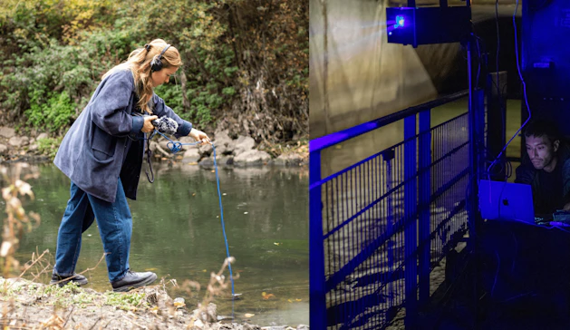
- Sewer Museum
Workshop digitale kunst met Romain Tardy en Coline Cornélis
- Others
View more
View more
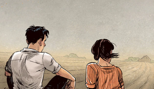
- Comic Art Museum - Brussels
Masterclass Aimée de Jongh
- Events
- Accessibility
View more
View more

- Bozar - Centre for Fine Arts
L’Academie des Secrets - Joachim Olender
- Events
View more
View more
- Planetarium of Brussels
Nocturnes x Planetarium
- Events
- Courses and workshops
- Accessibility
View more
View more

- MigratieMuseumMigration
Nocturnes
- Events
- Courses and workshops
- Accessibility
View more
View more
- La Fonderie - Brussels Museum of Industry and Work
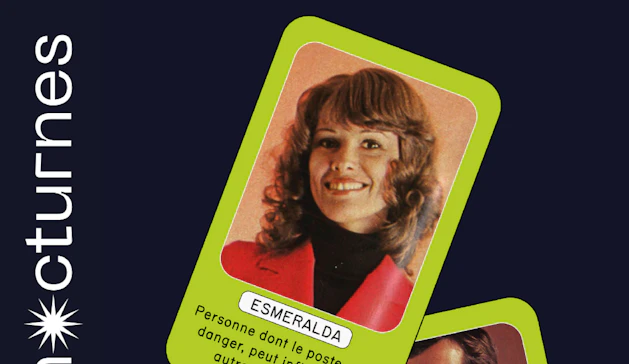
Nocturnes - Une soirée jeux à La Fonderie
- Events
- Courses and workshops
- Others
View more
View more
- —
- La Loge
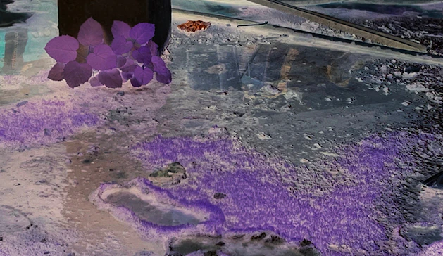
[UN]Perceptible Frequencies by Euridice Zaituna Kala
- Events
- Free
- Courses and workshops
View more
View more
- —
- Bozar - Centre for Fine Arts
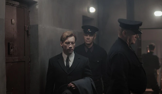
Two Prosecutors - Sergei Loznitsa
- Events
View more
View more

- —
- La Monnaie
Be[a]st
- Courses and workshops
View more
View more

- Bozar - Centre for Fine Arts
Vox Luminis XL & B’Rock Orchestra
- Others
View more
View more

- Bozar - Centre for Fine Arts
VOLT - Nick Coutsier
- Events
View more
View more
- Planetarium of Brussels
The Dark Side of the Moon Planetarium Experience
- Accessibility
- Others
View more
View more

- —
- Botanique
Emilie Terlinden - ‘Timelapse ’
- Exhibitions
View more
View more

